Pikes Peak YMCA logo

Details

Pikes Peak YMCA

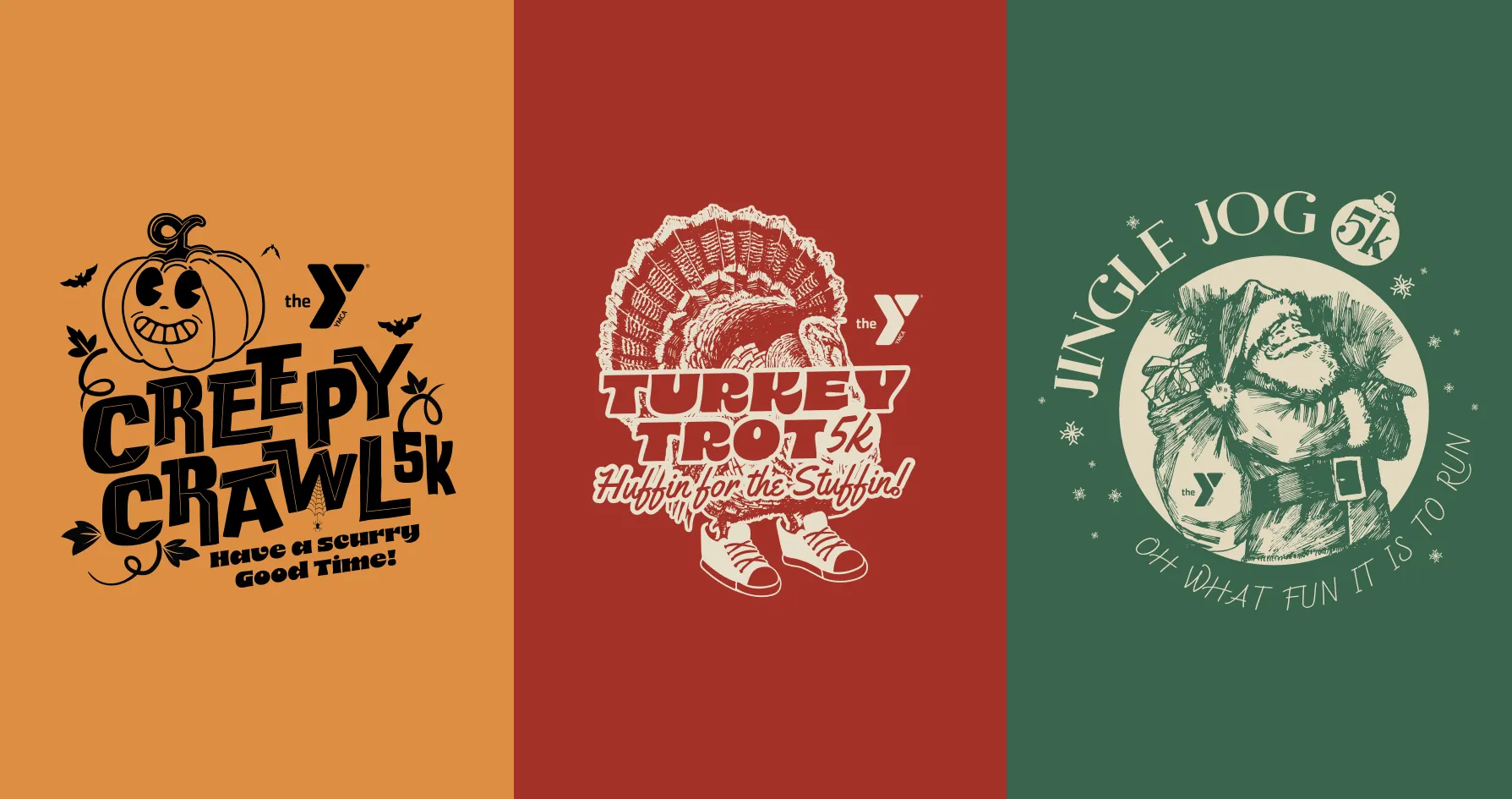
The Y plays a huge role in the community—ask anyone from Colorado Springs, and they have a Y story. My goal was to create a digital experience that feels clear, welcoming, and easy to for anyone to use. I designed their website using Google’s Material Design as a foundation, and created promotional assets for events—keeping everything fun, approachable, and aligned with the Y’s mission to help everyone belong and thrive.

Services

UI Design

Brand assets

Brand strategy

Year

2026

Client

Pikes Peak YMCA
White outline of a spherical grid-within-a-globe icon followed by the word “Orbita” in white sans-serif type, centred on a smooth lime-to-forest green gradient background.
A large white globe grid icon alone, centred on a vertical lime-to-forest green gradient.
The word “Orbita” in white sans-serif type, centred on a vertical lime-to-forest green gradient with no other graphics.
Close-up of a black smartphone’s top-left corner showing the Orbita app icon—a rounded square with the white globe grid on a green gradient—beside the Calendar and Mail icons, time reading 9:41.

Testimonial

"Stephen brought such needed clarity to the website. We also loved the shirts and posters he designed for us—the turkey with the running shoes was a major hit."

Theresa, COO of the Pikes Peak YMCA

Bright lime drawstring fabric pouch on a matching green backdrop, printed with a bold white globe grid logo at its centre.
Round black-and-white outdoor sign mounted on a white bracket against a green background, featuring a white globe grid logo on a black face.
Three side-by-side logo variations: top left — black globe grid and “Orbita” on lime; top right — black globe grid and “Orbita” on white; bottom — white globe grid and “Orbita” on a dark green gradient.

Create a free website with Framer, the website builder loved by startups, designers and agencies.